Linux Mint 19.1: A sneaky popular distro skips upheaval, offers small upgrades
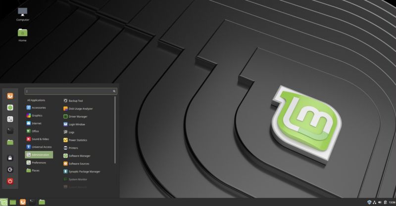
 Enlarge / Cinnamon 4.0's new look in Linux Mint 19.1
Scott Gilbertson
While Ubuntu and Red Hat grabbed most of the Linux headlines last year, Linux Mint, once the darling of the tech press, had a relatively quiet year. Perhaps that's understandable with IBM buying Red Hat and Canonical moving back to the GNOME desktop. For the most part Linux Mint and its developers seemed to keep their heads down, working away while others enjoyed the limelight. Still, the Linux Mint team did churn out version 19, which brought the distro up to the Ubuntu 18.04 base.
While the new release may not have garnered mass attention, and probably isn't anyone's top pick for "the cloud," Linux Mint nevertheless remains the distro I see most frequently in the real world. When I watch a Linux tutorial or screen cast on YouTube, odds are I'll see the Linux Mint logo in the toolbar. When I see someone using Linux at the coffee shop, it usually turns out to be Linux Mint. When I ask fellow Linux users which distro they use, the main answers are Ubuntu... and Linux Mint. All of that is anecdotal, but it still points to a simple truth. For a distro that has seen little press lately, Linux Mint manages to remain popular with users.
There's a good reason for that popularity: Linux Mint just works. It isn't "changing the desktop computer paradigm," or "innovating" in "groundbreaking" ways. The team behind Mint is just building a desktop operating system that looks and functions a lot like every other desktop operating system you've used, which is to say you'll be immediately comfortable and stop thinking about your desktop and start using it to do actual work.
It's worth asking then, why switch from what I have now to Mint? Well, if you're happy with what you have now, stick with whatever it is. But if "it" happens to be Windows 10, well, hope you haven't tried to upgrade yet. Or if what you have now happens to be Ubuntu prior to 18.04 and you're dreading the upgrade to GNOME, suddenly Mint is worth a look.
The project recently released version 19.1, which comes in three desktop flavors. There are two homegrown projects, Cinnamon (really Linux Mint's main desktop) and MATE, which started as a kind of Cinnamon light and has since become a very capable desktop in its own right. On top of those, there's also an XFCE version. Previously, there was also a KDE version of Linux Mint, but it was dropped last year because the KDE stack is different enough that all the bits that make Linux Mint, well, Minty, just didn't work with KDE. Diehard Mint and KDE fans can still get KDE working via a PPA, but it's not officially supported by Linux Mint.
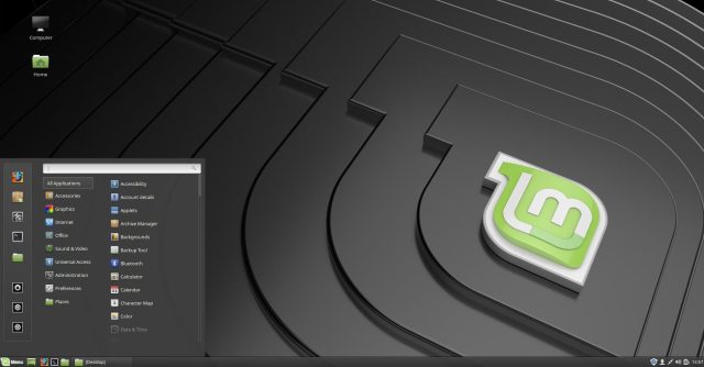
In this iteration, like many predecessors, Cinnamon is the desktop that really shines for Linux Mint. It has been a mature, stable project for some time, and it hasn't seen much in the way of change in years. It uses a very familiar paradigm: a bottom panel that holds a button menu on the left, a good-old Windows XP-style windows list in the middle, and a system tray on the right.
That traditional look and feel has finally been tweaked a little for Cinnamon 4.0. For Linux Mint 19.1, nicknamed "Tessa," Cinnamon has an optional new "modern" look.
Fear not, change haters, the old look is just a click away, and the redesign is pretty mild anyway. But by default, Mint 19.1 Cinnamon will look a touch different to long-time Mint users. Cinnamon 4.0 has a slightly larger task bar and icon set, but the big difference in terms of usability is that windows are grouped by application. Hover over an icon in the task bar, and you'll see window previews for any open windows. It looks and behaves like the same feature in Windows and macOS.
The new look is a result of Mint devs discovering that a lot of users were replacing the standard window list applet with a third-party window list applet to get the window grouping and previews features. Mint decided it should have that feature out of the box, so it forked the code and integrated it into Cinnamon directly, along with some other customization options like icon size.
 Enlarge / Cinnamon 4.0's old look in Linux Mint 19.1—that familiar look is just a click away.
Scott Gilbertson
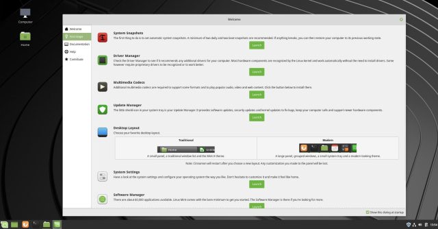
I happen to prefer the old look and paradigm where each window gets its own button. To revert to the older style, you can either head into the Mint settings panel, or you can do it right from the start using the option in the Mint welcome screen. Click the sidebar item labeled "First Steps" and look for the Desktop option. Putting the option to select your favorite layout in the welcome screen is a nice touch, and it's emblematic of Linux Mint's approach to change—give users a choice rather than just shoving the latest and greatest down their throats. Sure enough, after a couple of weeks of using it, I decided I liked the new "modern" theme better.
 Enlarge / Linux Mint's very nice Welcome app walks you through setting up your machine.
Scott Gilbertson
As has been the case for some time, Cinnamon itself does not see any major new features in this release. And in a day and age when system updates seem to wreak havoc, I'd argue that's a feature not a bug. There are still improvements aplenty, the most notable being that the Nemo file manager is, according to Mint, three times faster than the previous release thanks to some code optimizations. I don't have an objective way to test it, but Nemo, which I've used extensively under Arch, does seem quite a bit faster than I'm used to, particularly when dragging windows around.
Cinnamon in general feels snappier, something Mint says will be even more obvious if you have an NVIDIA card. There's a new option in the Cinnamon settings to turn off VSYNC, and disabling VSYNC will get you higher FPS, thus making things feel snappier. However, this option pushes VSYNC tasks off to your GPU driver, which needs to handle it—if you see a lot of screen tearing, especially when watching videos, turn VSYNC back on. But if it works without tearing, you should see a performance boost and perhaps eliminate some input lag.
Exposing low-level options like this is, I believe, why the Mint distro tends to be a popular destination for users who are, if not fed up with, at least feeling a little let down by, Ubuntu. A very similarly exposed low-level feature is an ability to browse and see the support status of all available mainline kernels in Mint's Update Manager. You can also now easily remove unused kernels with the click of a button.
Mint's Software Sources tool also looks slightly different in this release, more in line with the rest of Mint's Xapps since it now uses the Xapp sidebar and a headerbar.
Linux Mint's Mint-Y theme, the default in both Cinnamon and MATE, continues to be refined in subtle ways. Through a series of very slight changes, Mint Y ends up with significantly improved contrast. To me, this was most noticeable in background windows. Or, rather, I should say the opposite: the foreground window is much more noticeable thanks to the darker, more contrasty text. Once the kind of attention to detail you'd have to turn to macOS to find, this is the sort of polish that has become part of many Linux desktops lately (certainly elementaryOS sweats these things, and Ubuntu got that ball rolling so speak). As someone who spends most of my time in either a terminal window or a Web browser, these improvements are a little lost on me. But for those who crave them, Linux Mint 19.1 delivers.
To see the difference between old and new themes, check out the first screenshot below, which shows a Nemo file browser window with the Mint-Y theme as it was in Mint 19 (on the left), and using the Mint-Y theme with changes in 19.1 (on the right):
Post a Comment
Post a Comment